
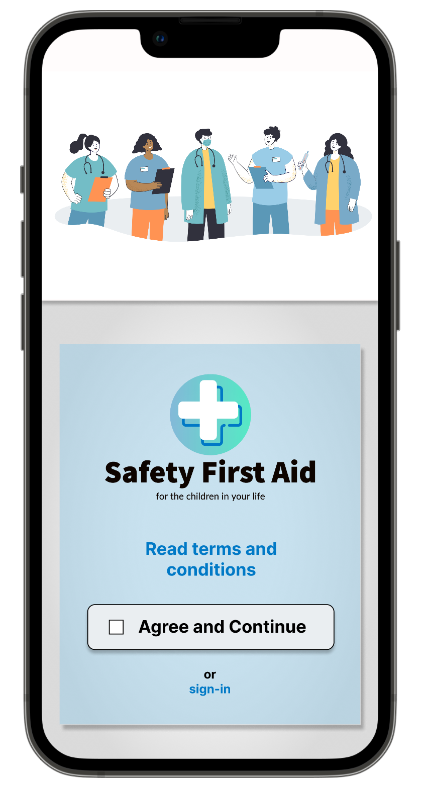
PROJECT: Safety First Aid Mobile App And Website
ROLES: Visuals, Wireframing, Prototyping, UX Research
TOOLS: Figma, Miro
DURATION: June 2022 (1 week)

PROJECT VISION
The task was to create an app to help people with basic first aid in emergency situations. My solution was Safety First Aid, a fictional non-profit dedicated to empowering individuals to have confidence in responding to emergency situations. The design solutions needed to be succinct and easy to follow because when a user is in emergency mode time is of the essence. With that in mind, the app distills only pertinent information for the users. The accompanying responsive website expands on offerings to include courses and an in-depth kid’s area. The website is geared towards preparation and learning where the app is meant as a quick guide to help users solve problems.
THE GOALS
Develop a clear and concise way for users to access first aid information in emergency situations.
Uncover the features most desired by users.
Understanding the User
I conducted an empathy study to understand the users I’m designing for and their needs. I identified two main user groups of the many available: elderly retired adults and new parents. While the app has many more user groups, I concentrated on understanding these two groups as a way to keep the project focused. Additional research and consideration of other groups will be needed to ensure the product addresses user needs.
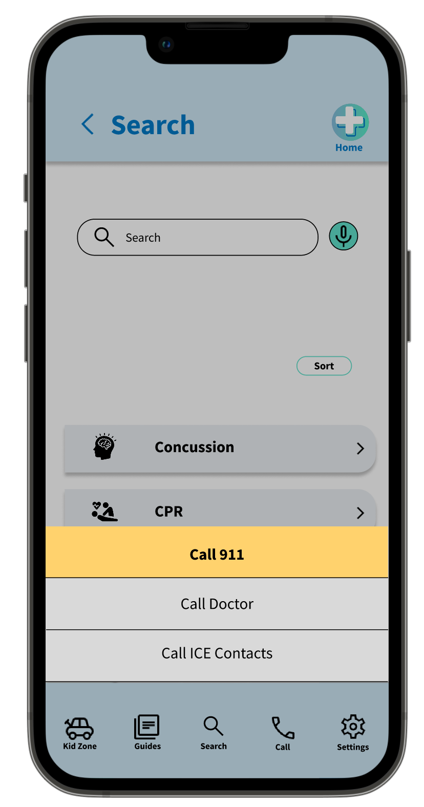
These user groups confirmed the need for a comprehensive guide on basic first aid. They expressed concern in accessing information as mobility, arthritis, and preoccupation with children were hindrances. Research revealed that being able to speak into the phone was a desired feature in these emergency situations. It also revealed users wanted to receive the information in many ways (visually, auditorily, through reading) because it not only helped with comprehension but was flexible to fit the circumstances of the situation.
Key Questions:
What is the product and who is it for?
What are our current user pain points in accessing information about first aid?
Which platforms do our users use most?
What kinds of features do our users seek?
What assistive technologies need to be included in the design?
USER PERSONAS

ROSALIE HALE
Age: 85
Education: High School
Hometown: Cleveland, OH
Family: Widowed
Occupation: Retired
Rosalie lives alone in the same house where she raised her children. Although she no longer drives, she enjoys the sense of independence and accomplishment that taking care of herself and tasks around the house brings. As she has grown older, her balance and coordination has declined, making it more likely that she sustains minor injuries on her hands and legs. She doesn’t want to be a bother to her children and grandchildren, who live busy lives of their own. As a result, she seeks a resource to help her navigate these minor injuries and guidance on when to call for help.

TERRELL WILLIAMS
Age: 33
Education: BA in Business
Hometown: San Francisco, CA
Family: Married, two kids
Occupation: Sales Representative
Terrell is a busy working parent with two young children. His partner recently took a job working the late shift, often leaving Terrell alone to watch the kids. He’s a relatively new and nervous parent, stressing over every cut and bump that his active kids accrue from running and playing around the house. He would like to gain confidence in his ability to watch the kids and believes that access to knowledge is one way that he can improve his skills. He seeks easily searchable online resources to help him problem-solve the day-to-day problems that arise.
USER JOURNEY MAP
Following Rosalie’s journey highlighted the need for adaptive technology within the search function. It also shed light on possible features such as an inventory tracking system for personal first aid kids, app access to doctor phone numbers and emergency contacts, and the need for a pared down approach to disseminating information.
COMPETITIVE ANALYSIS
Competitive analysis was focused on existing first aid apps and how they function. This research included investigating the layout, categorization of each app, and types of media used within the app. I also wanted to uncover how each handled the legal disclaimer and highlight an overview of any children-specific features, which will be included as placeholders in this iteration of the project. The three apps featured in this research were First Aid Kit App, American Red Cross, and FirstAIDFast.
Competitors’ designs showed that key features are comprehensive videos, guide lists, an in-app call function, and easy to use layout.
Some opportunities I identified include:
Ensuring instructions and guides are clear
Including high-quality videos
Adding a speech-to-text function for search
Removing ads and other unnecessary information that distracts from the content
USER PAIN POINTS
Based on a synthesis of the two user groups identified for user research in this project, I categorized user pain points into four main groups of focus.
STARTING THE DESIGN
I started with paper wireframes for a quick way to visualize some of the features to be included in the app design. In this iteration of the design, I preferred access to navigation along the bottom of the app to remain always visible and a homescreen with quick hits for links to save users time. All features considered prioritized removing barriers to access the information the users needed.


DIGITAL WIREFRAMES
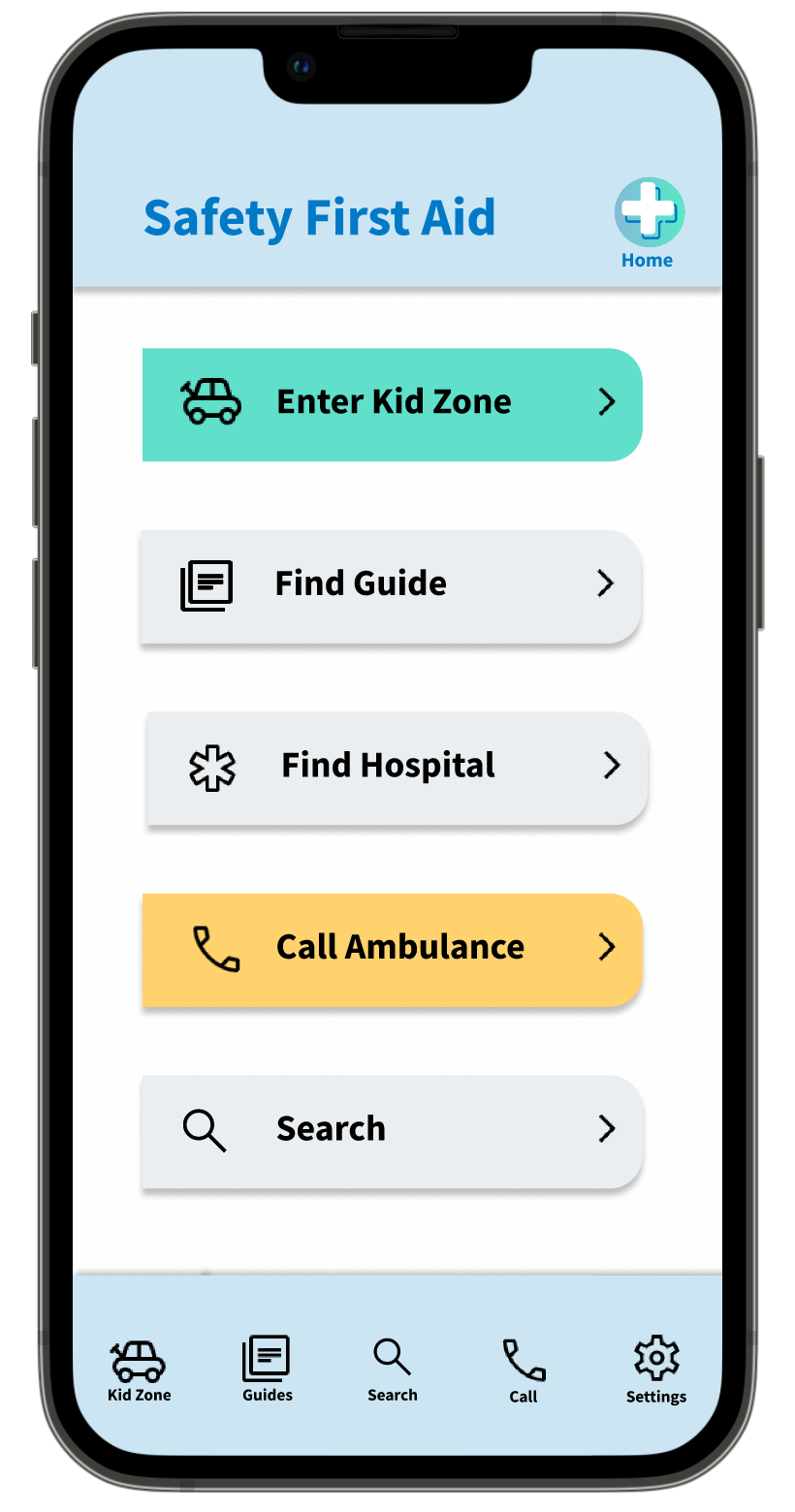
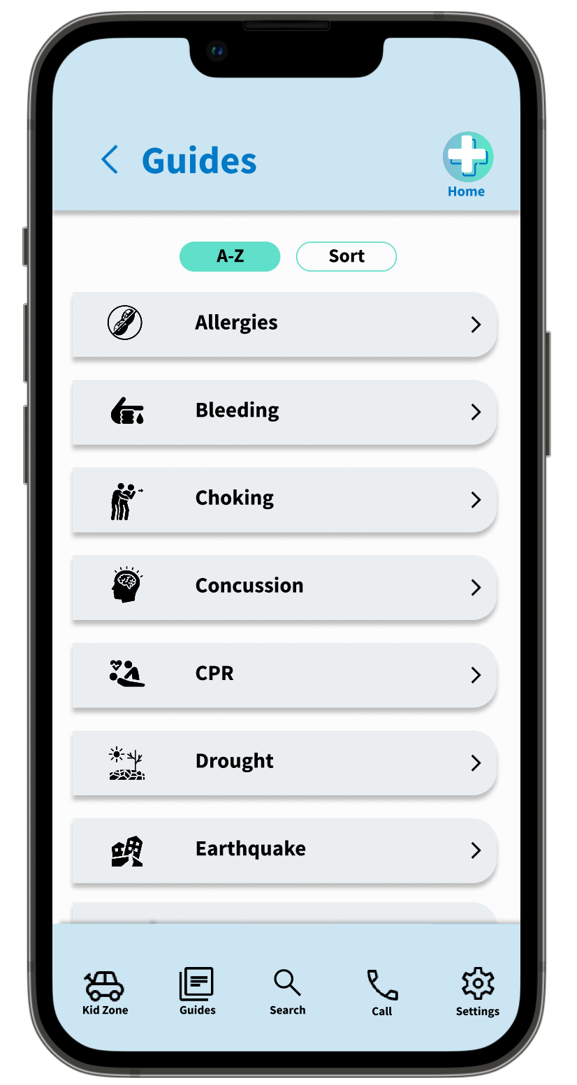
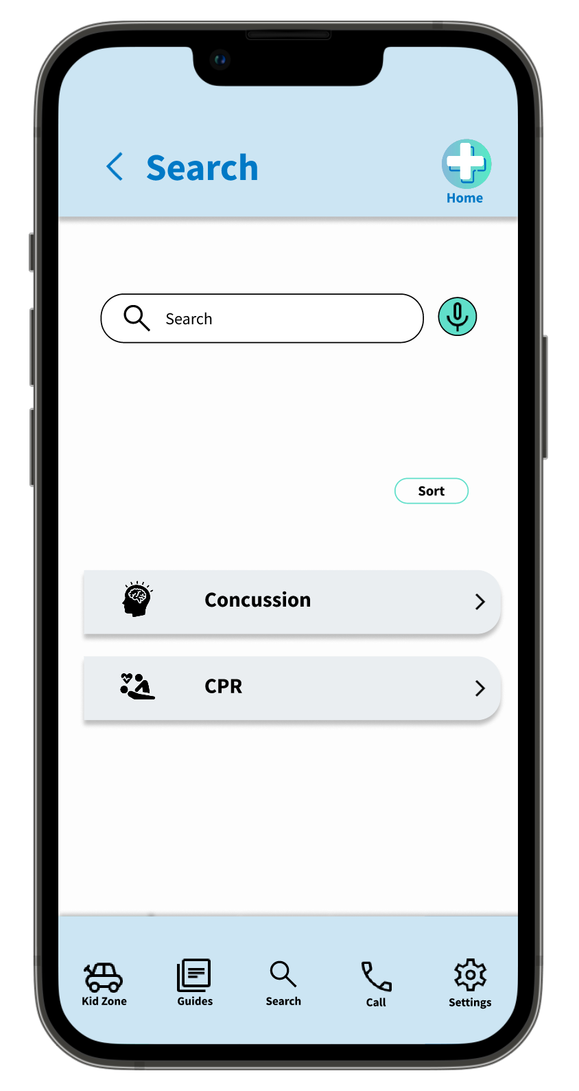
Removing visual clutter was the most successful in allowing the user to find information fast in emergency situation. Including links on the home page gives the user access upfront to their needs. From the main page, users can make an emergency call directly from the app or locate the nearest hospital. The search button is featured prominently on this page as well as in a centralized location on the always visible bottom navigation bar.


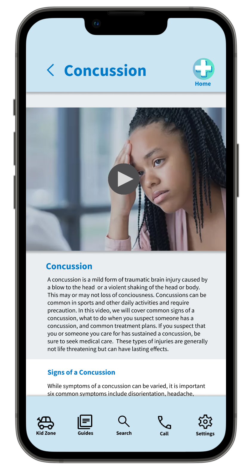
Users wanted content to be delivered in multiple media including video, sound, and text. Providing topical videos with video script satisfies this user need and delivers the content in easily digestible ways. The added section headers and script text of the format fulfill the accessibility needs of the app’s users.
Wireframes: Responsive Website Variations
The responsive website shifts the focus from emergency response to learning. It provides users with more in-depth information, a place to take courses, browse topics, and spend more time with the content.
ITERATION
The low-fidelity prototype of the app tested the main user flow from login to finding information on a particular topic. A second low-fidelity prototype tested the functionality of the responsive mobile site, which focused on the ease of navigation through drop-down menus.
A short usability study was conducted through peer feedback. The focus of the study was on overall navigation and ease of finding content of both the app and responsive mobile site.
Findings
Users want speech to text more visible in the search portion of the website.
Users didn’t understand the purpose of the prepare tab and didn’t find it useful in an emergency situation.
User’s couldn’t navigate to the kids because information was missing.
Users want ways to categorize and sort search results and guides.
PROBLEM SOLVING

Users were confused by the prepare tab in the navigation menu. That was replaced by the kids’ zone tab, which users also had difficulty locating. The preparation guides were moved to fall under the find guides section of the site. Theme colors were used to highlight and separate parts of the menu.

Users did not find the sorting by symptom to be useful because it led to undesired search results and confusion. The symptom sorter was replaced by a more general sort functionality to give users more control over their results. Additionally, the preparation guides were added to the guide database allowing all information to appear in one place.
Mockups: Dedicated App
MOCKUPS: RESPONSIVE SITE SCREEN SIZE VARIATIONS
MATERIALS AND ASSETS GUIDE FOR SAFETY FIRST AID

NEXT STEPS

TAKE AWAYS
The Safety First Aid app and responsive website will provide a valuable resource for people in emergency situations and for people looking to prepare ahead for the future.
WHAT I LEARNED
This project broke open the design differences between a dedicated mobile site and a responsive mobile site. It helped me conceptualize two different products, under the same brand, that had different use cases. It also helped me develop my asset building and showed what a time saver pre-defining text, colors, and assets can be when creating multiple designs across platforms.