
PROJECT: GATE GALLERY APP
ROLES: Visuals, Interaction, UX Research
TOOLS: Figma, Miro
DURATION: April 2022- May 2022 (4 weeks)

PROJECT VISION
Gate Gallery is a small gallery located in Detroit. Their mission is to provide a platform for local Detroit artists to exhibit and sell their work. They are dedicated to increasing engagement with the local community and providing clear and easy ways to learn about the artists they exhibit. They want to make art buying accessible from the first-time art buyer to the seasoned professional.
THE GOALS
Provide a searchable way to learn more about the artists in the gallery.
Create an easy way to remotely buy art from the gallery.

UNDERSTANDING THE USER
I conducted an empathy study and created empathy maps to understand the users I’m designing for and their needs.
A primary user group identified was working adults interested investing in Detroit’s cultural economy. This user group confirmed that local artist information at the gallery was difficult to navigate and access. Research also revealed other types of desired information missing entirely that many users felt would allow immersion in the gallery experience and a connection to the greater Detroit arts community.
Key Questions
What is the product and who is it for?
What do our primary users need most in the app?
Which users are most important to the business?
What types of information do our users seek?
What are our current user pain points in buying art?
USER PERSONAS
KJ CARD

Age: 20
Education: BFA in Fine Art
Hometown: Chicago, Il
Family: Single, Lives with Roommates
Occupation: College Student
KJ is an out-of-towner that moved to Detroit to study Fine Art at the local downtown college. Their hope is to integrate into the Detroit arts scene to find their own creative voice and improve their art-making skills. They are having difficulties finding information on local artists and the arts scene due to the lack of availability and seek resources to fill this knowledge gap.
SAMSON MCAFEE

Age: 55
Education: Juris Doctor Degree
Hometown: Metro Detroit, MI
Family: Married with two kids
Occupation: Lawyer
Samson is a lawyer at a private firm with a demanding schedule. He is long-time resident of Detroit and the surrounding area and believes strongly in the city’s future. When he manages free time, one of his favorite ways to spend a night out with his family is to visit the art gallery’s newest exhibition. He wishes there was a way to engage with his favorite local artists more deeply and share this information with his out of town business partners.
USER PAIN POINTS
Based on user research, I categorized focus areas to address user pain points.
Recognizing overlapping user needs shed light on possible features for the design.
COMPETITIVE ANALYSIS
I looked at a variety of other art galleries and related businesses to determine which features have already been prioritized in others’ designs and how they can be improved upon. The research included two direct competitors, Toi Art Gallery and First Street Gallery, as well
as two indirect competitors, Art Basel and artsy.com. Research showed that many small local galleries do not yet have their own apps for their collections making Gate Gallery ahead of the curve.
Competitors’ designs showed that a comprehensive search and quick access to navigation are key features.
Some gaps in their designs include:
Competitor products don’t highlight artist information.
Competitor products provide a limited amount of accessibility features.
Competitor products lack engaging imagery.
These results pointed to some key areas of improvement including:
Some opportunities we identified include:
Offering searchable access to artist bios, curator recommendations, art categories, and similar products
Using multiple images of each artwork to highlight different contexts, angles, and craft
Integrating our app with voice assistive technology
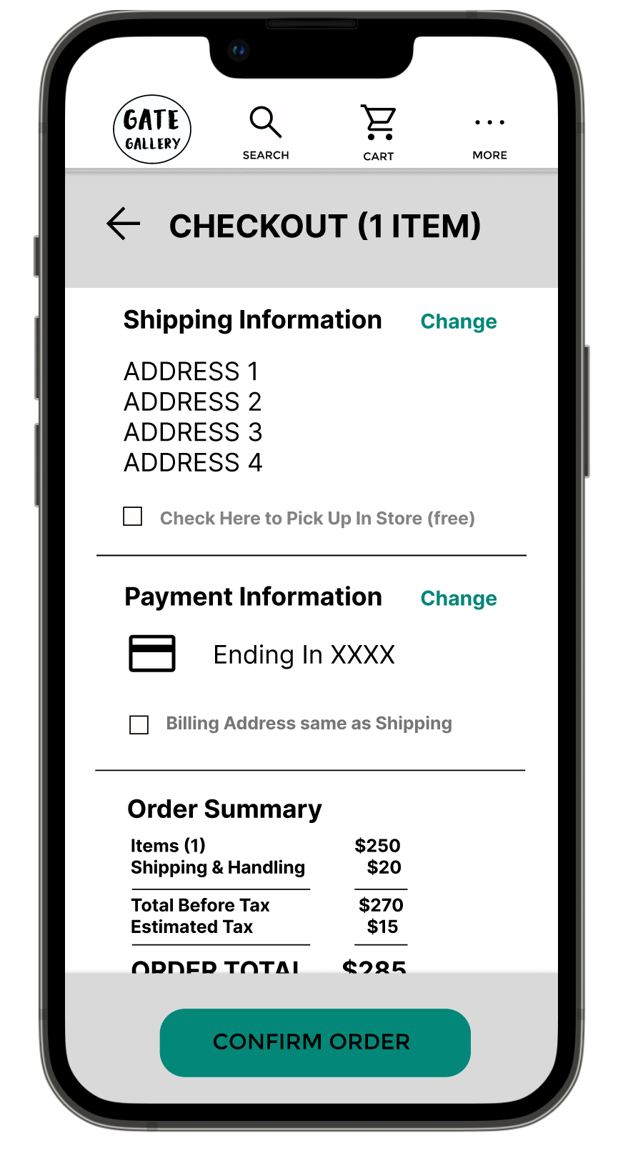
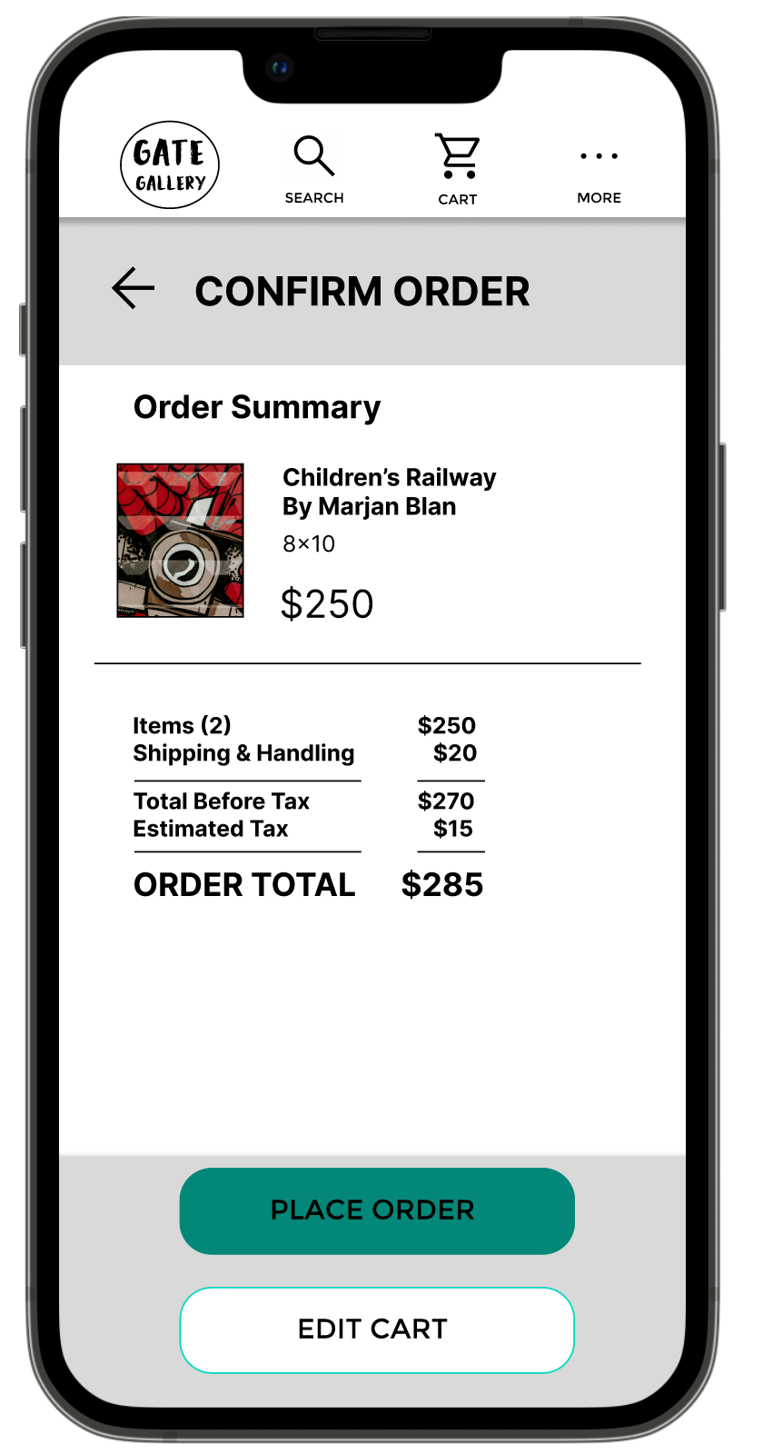
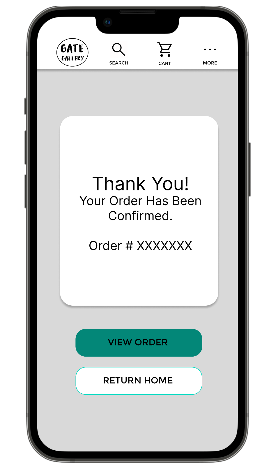
Creating a straightforward process for order, checkout, and delivery tracking
STARTING THE DESIGN
Paper wireframes were used to create quick sketches of the homescreen, prioritizing the ease of purchasing within the app. With the design, I favored quick access to a detailed search function and links to available artwork to aid the art the purchasing process.
Wireframes were created based on these paper designs. The wireframes went through two iterations as feedback improved upon the designs and I focused on solving key user problems.
ITERATION
The low-fidelity prototype focused on the user flow from searching for and buying a piece of art. The goal was to improve upon the process that road blocked users from interacting with local art in the way they wanted. The prototype was used in usability studies, which showed a need for making the navigation and cart functions prominent in the navigation bar.
The design was updated and then added visual content was added to create a high-fidelity prototype. The high-fidelity prototype was also used in usability studies to test the improvements from the low-fidelity prototype and ensure that changes didn’t create additional roadblocks.
Key findings from usability testing from both the high-fidelity and low-fidelity prototype:
PROBLEM SOLVING

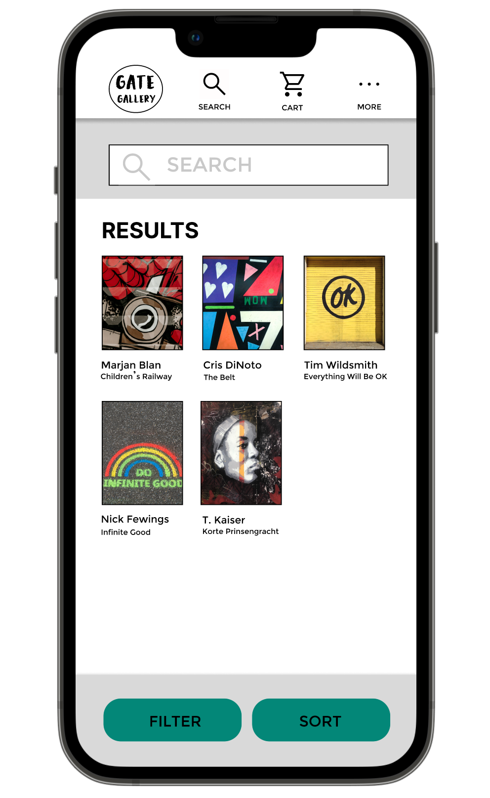
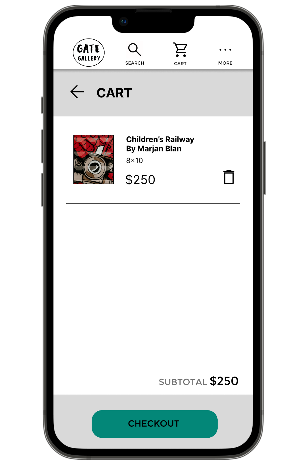
Early designs allowed for access to the search function from the homepage but left out navigation to search from other pages. Additionally, the cart was only accessible when adding an order to it. Access to these functions frustrated users. To remedy this, search and cart buttons were added to the top navigation bar.

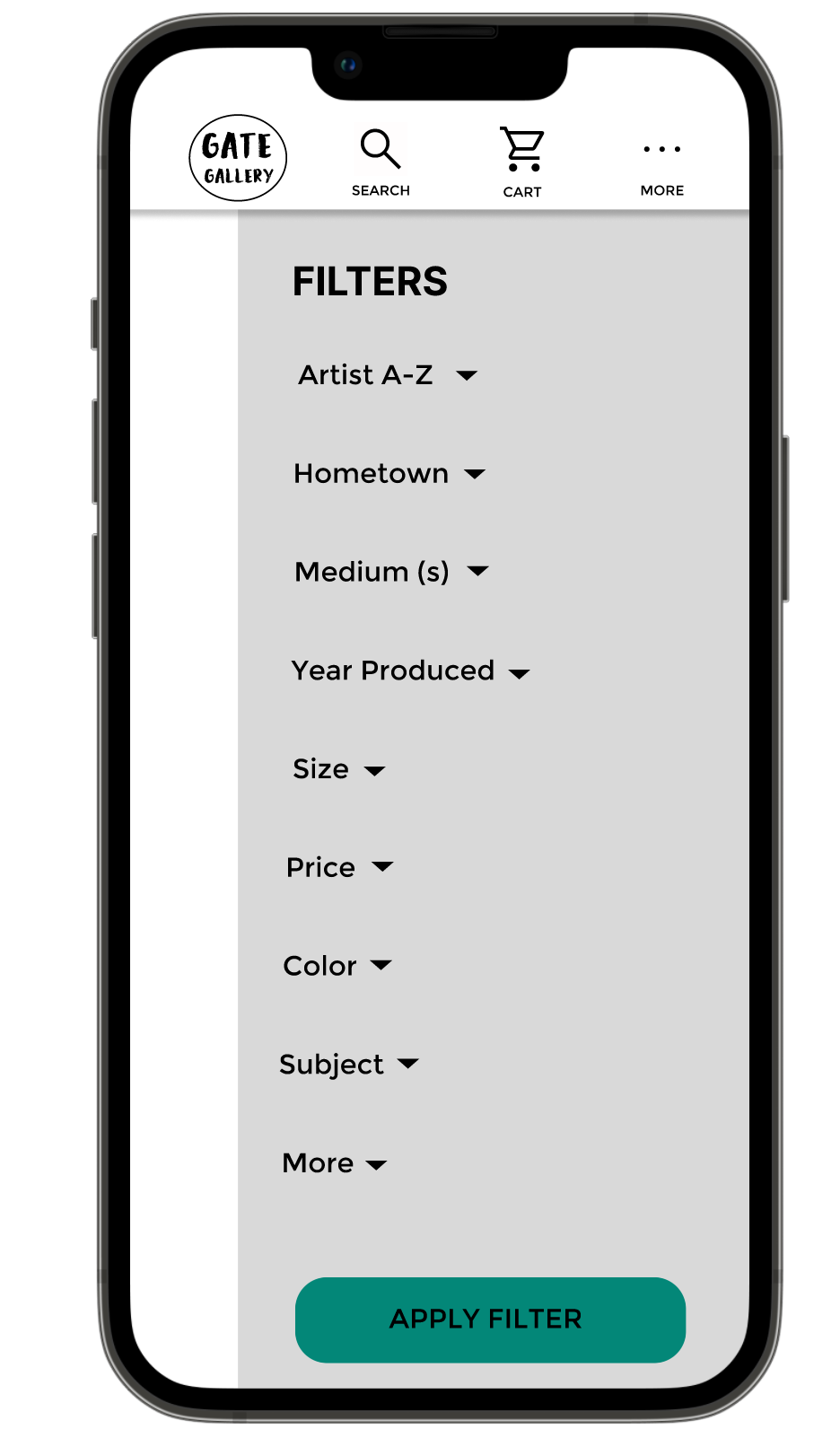
The second round of user testing revealed the need for a sort option in the search feature as users wanted to be able to refine their search results. Additionally, accessibility concerns arose about the color contrast between the buttons and background elements, which was increased to meet accessibility standards.
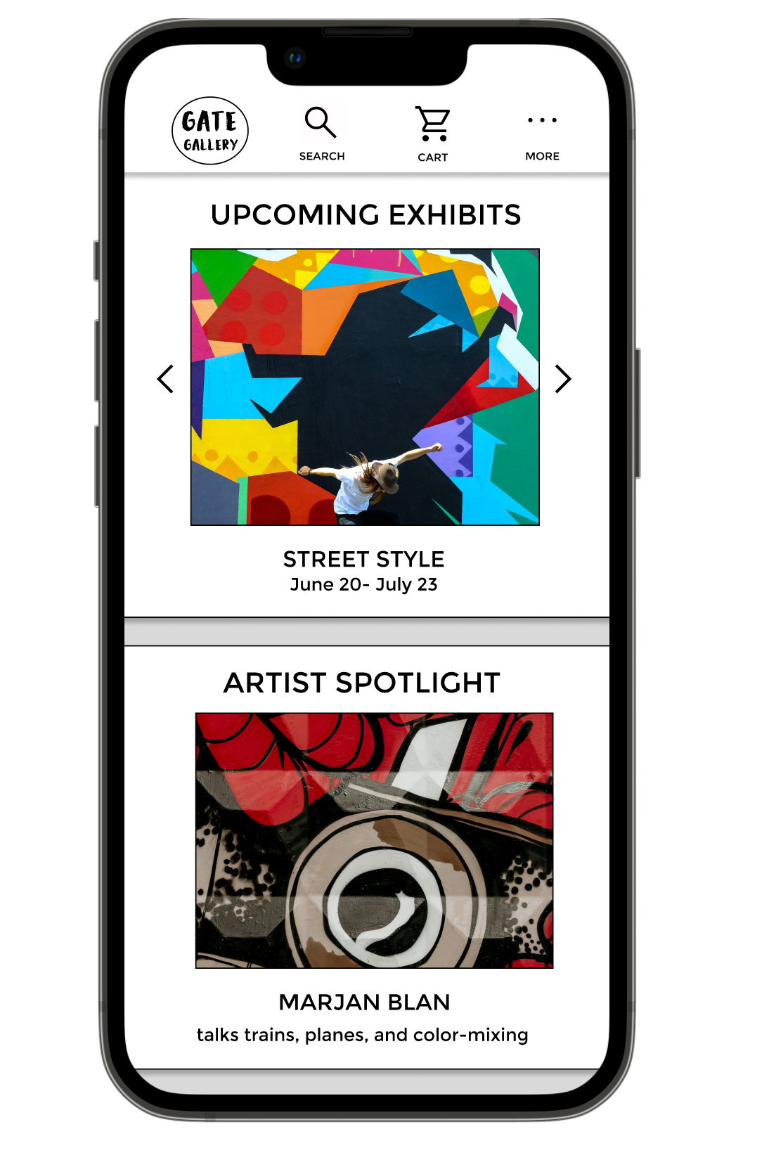
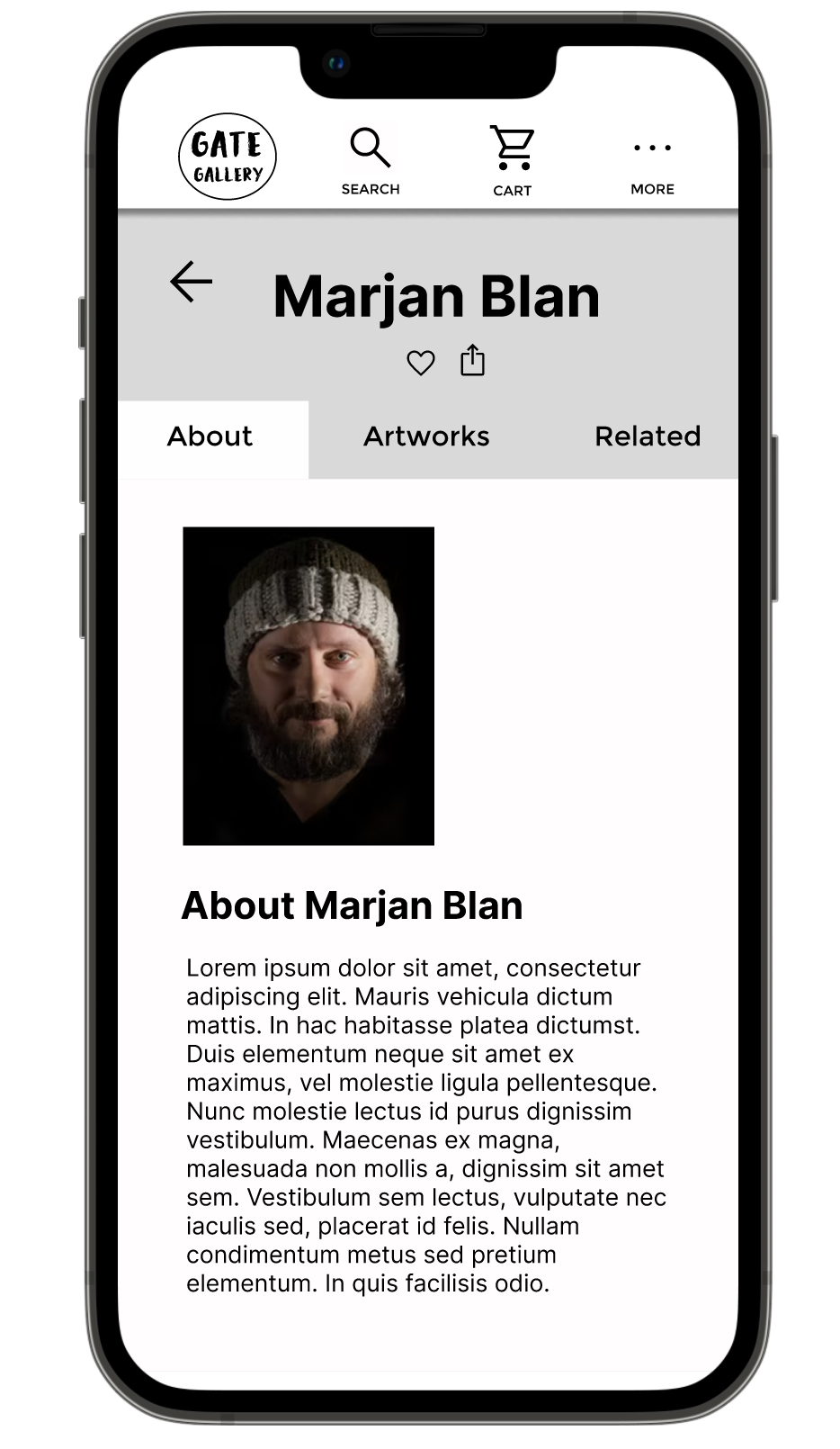
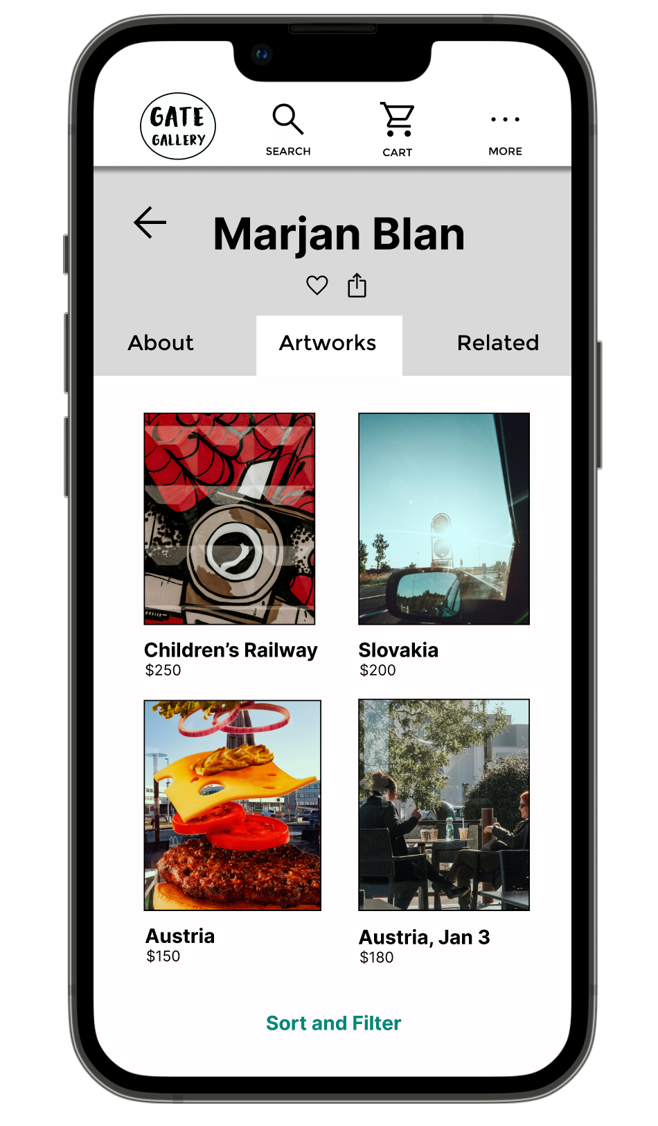
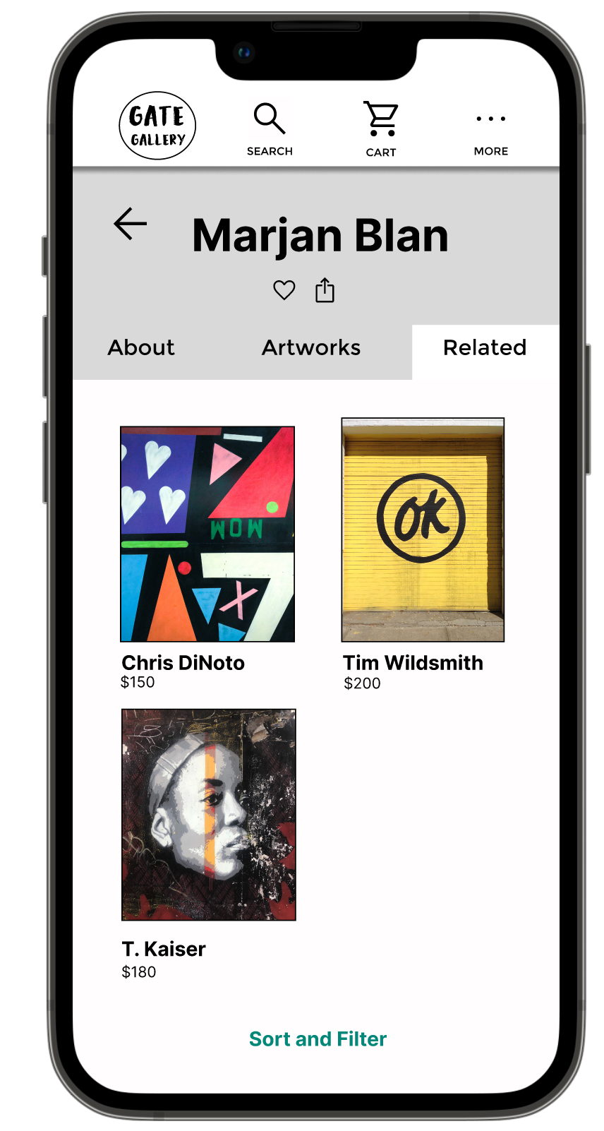
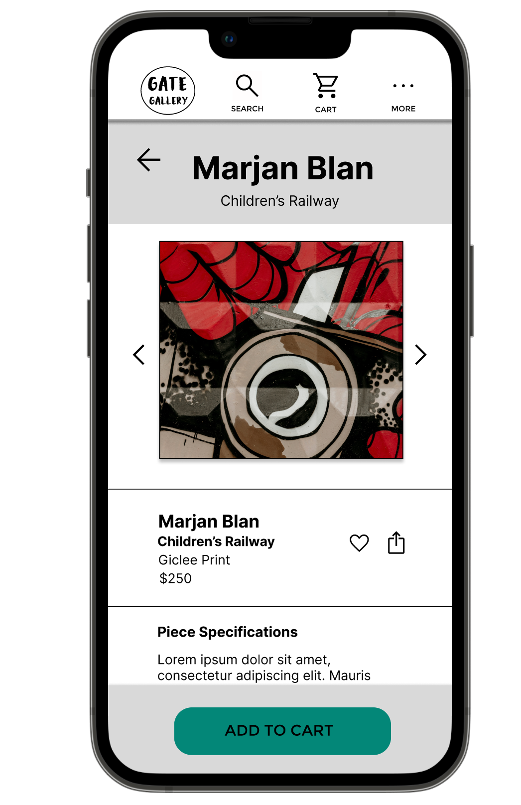
The final high-fidelity prototype presented easier access to the search and cart, simplifying the user flow to add objects to the cart. The prototype also answered user concerns about accessing artist information and navigating easily between screens.
TAKE AWAYS
Impact:
This app demystifies the art-buying process and provides users’ with a connection to Detroit’s local arts community.
What I learned:
While designing the Gate Gallery app, usability studies were instrumental in learning what features users needed. It provided insight on how to re-organize information and led to the updated artist page design with tabs. I learned the importance of making key actions visible in navigation.