
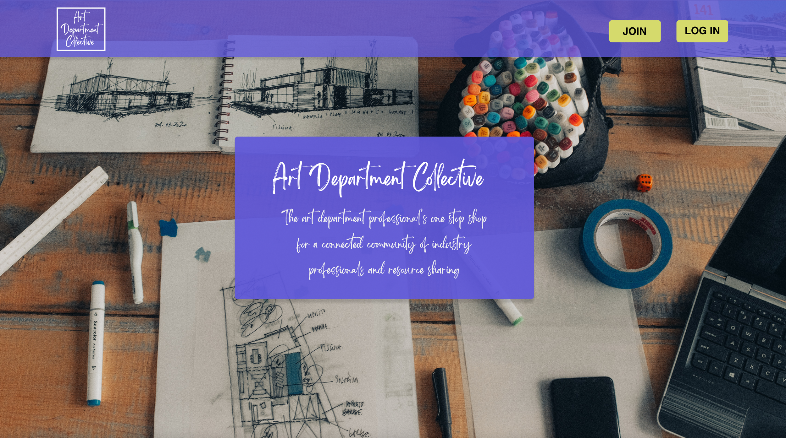
PROJECT: ART DEPARTMENT COLLECTIVE Responsive WEBSITE
ROLES: Visuals, Wireframing, Prototyping, UX Research
TOOLS: Adobe XD, Miro
DURATION: June 2022 (2 weeks)

PROJECT VISION
The Art Department Collective is an online community platform for film art department professionals. It offers a database of instructional videos as well as a community forum where users can pose questions. They want to improve their designs to provide quick and easy ways to access the content because their users’ busy schedules and tight turn-around times do not leave much time for searching. They desire to improve engagement between their users to create an economy of sharing and connection. The product includes a web and mobile version.
THE GOALS
Develop the community section of the website to include instant communication and resource sharing.
Uncover the most beneficial navigation items for the responsive design to save users time during their search.
UNDERSTANDING THE USER
I conducted an empathy study and created empathy maps to understand the users I’m designing for and their needs. A primary user group identified was art department assistants working in film production.
This user group confirmed that information about production design and practical art department tricks was difficult to find online. Research also revealed that newer members often feel isolated without the accessibility of formal training or mentorship. Lack of time was another major factor in their need for quick and effective information.
Key Questions:
How are our users currently searching for information about film design?
What are our current user pain points in accessing information about film design?
What types of information do our users seek?
How do our users currently connect with their community?
What are barriers to access in connecting with the community?
USER PERSONA
JOSEPH PARK
Age: 21
Education: BA in Film
Hometown: New York, NY
Family: Single
Occupation: Art Department Assistant
Joseph is a freelance art department assistant looking to build a portfolio of clients to bring in consistent work. Every time he’s on the job, he’s asked to do something he’s never done before. He finds this part of the job exhilarating and frustrating because often the more senior designers do not have time to show him the ropes and the information he needs is buried deep in the internet.
User Journey Map
Following Joseph’s user journey highlighted the need for an easily searchable database. It also demonstrated the need to be able to ask and receive answers to questions in real time. Time is of the essence in his line of work so including features to minimize clicking and keep navigation simple will be beneficial to getting the answers Joseph needs fast.
USER PAIN POINTS
Based on user research, I synthesized the results to find three focus areas to
address user concerns. Recognizing these user needs gave focus to the
ideation of features for the design.
COMPETITIVE ANALYSIS
I looked at a variety of video-sharing platforms as well as community resource-sharing platforms, which match the blended goals of this responsive website. The research included investigating the categorization and search functions of video database sites such as Youtube, Vimeo, and Dailymotion. It also included filmmaking-specific sites with a community component such as Ungated Collective and Stage 32. Research showed that there are few communities dedicated solely to production design and none that focus on aggregating informational videos.
Competitor’s designs showed that a comprehensive search, member account, tracking favorites, and community discussion topics are key features.
Some opportunities I identified include:
Offering specific and direct searchable access to videos
Notifications when videos on a specific topic become available
Integrating community interaction
Creating a straightforward process for community sharing
STARTING THE DESIGN
Paper wireframes were used to create quick sketches of the homescreen, prioritizing the ease of access to community resources and video sorting options. With the design,
I favored quick access to the search function at the top of the page and an open navigation sidebar to make it easier for users to jump between sections of the website in search of the answers to their questions.
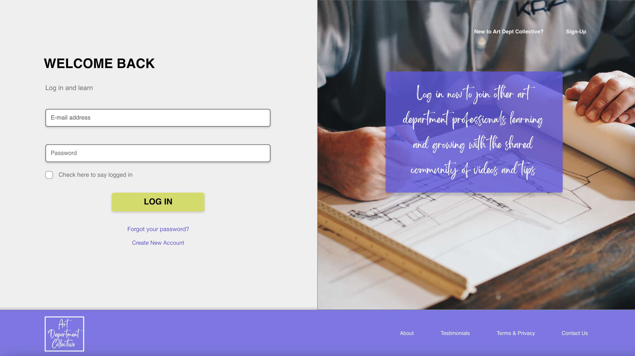
DIGITAL WIREFRAMES
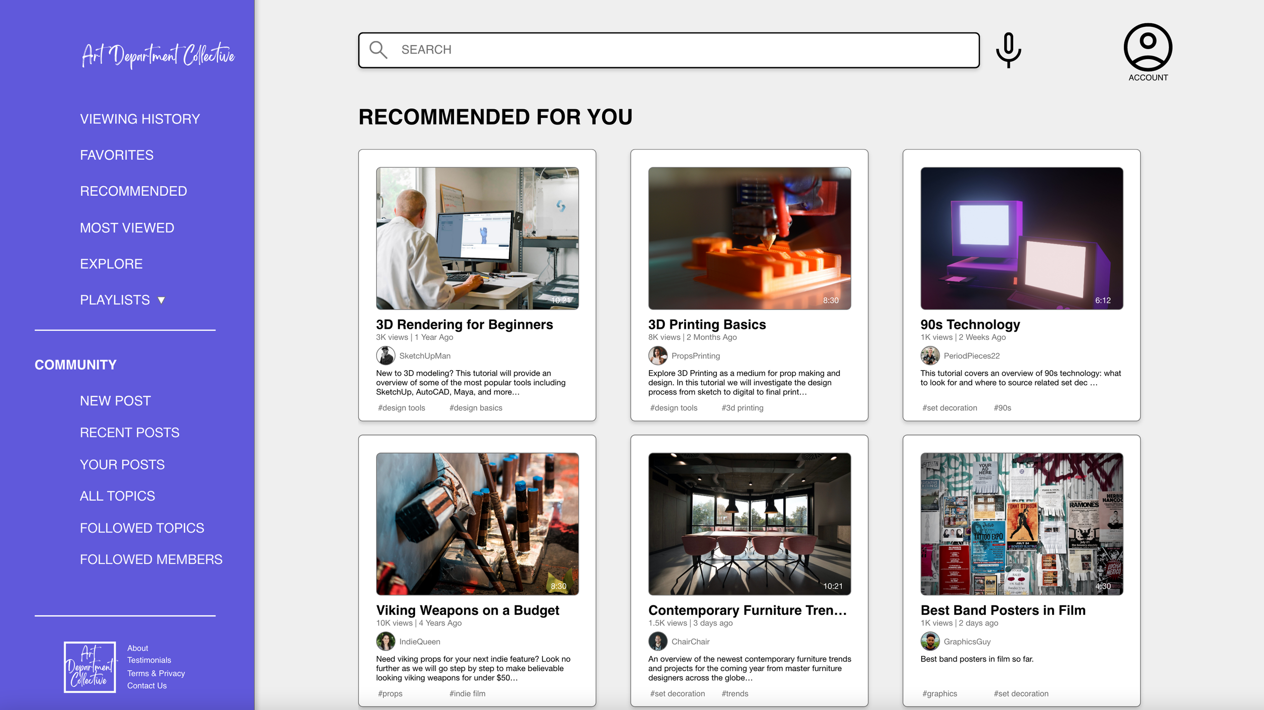
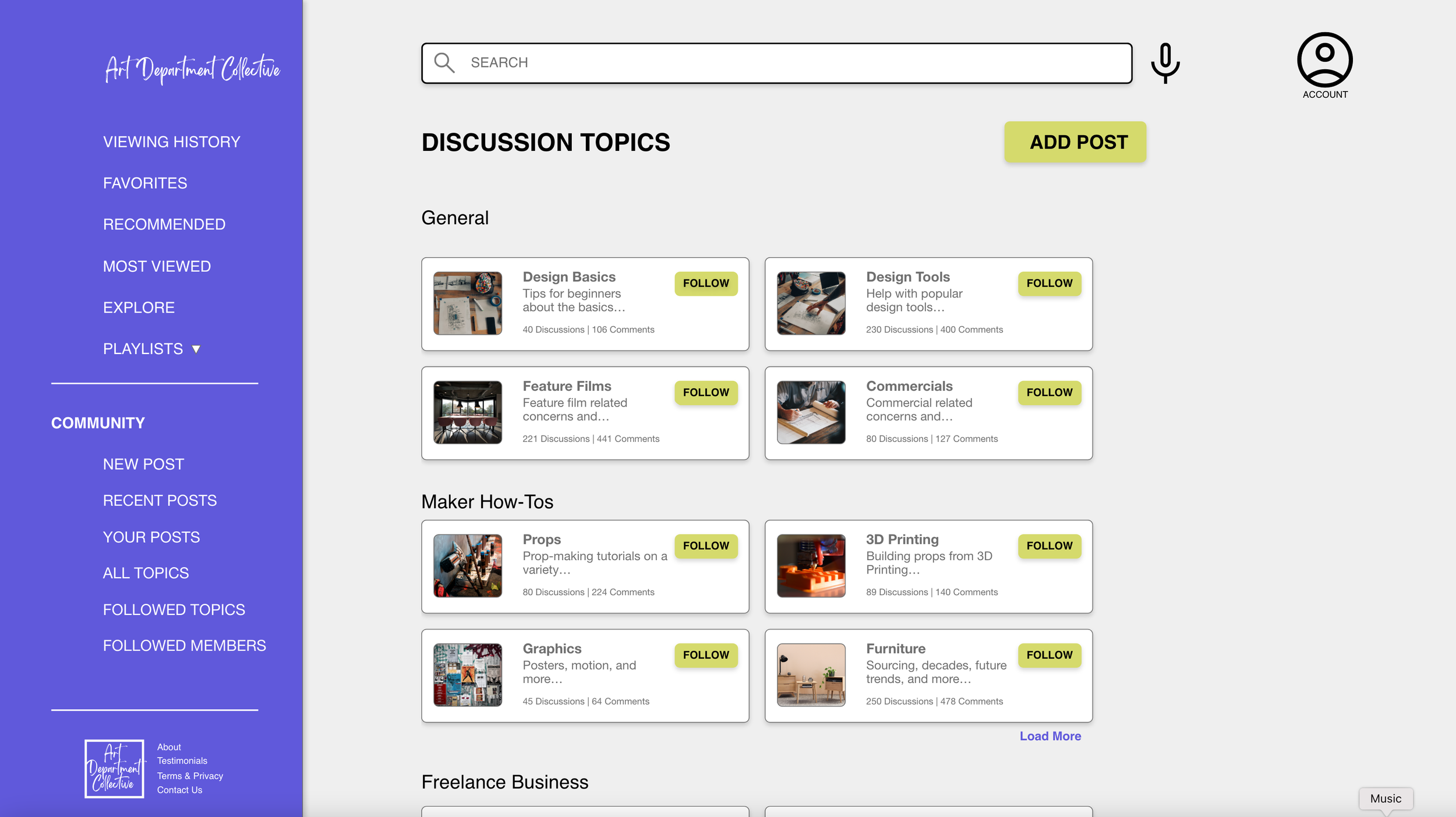
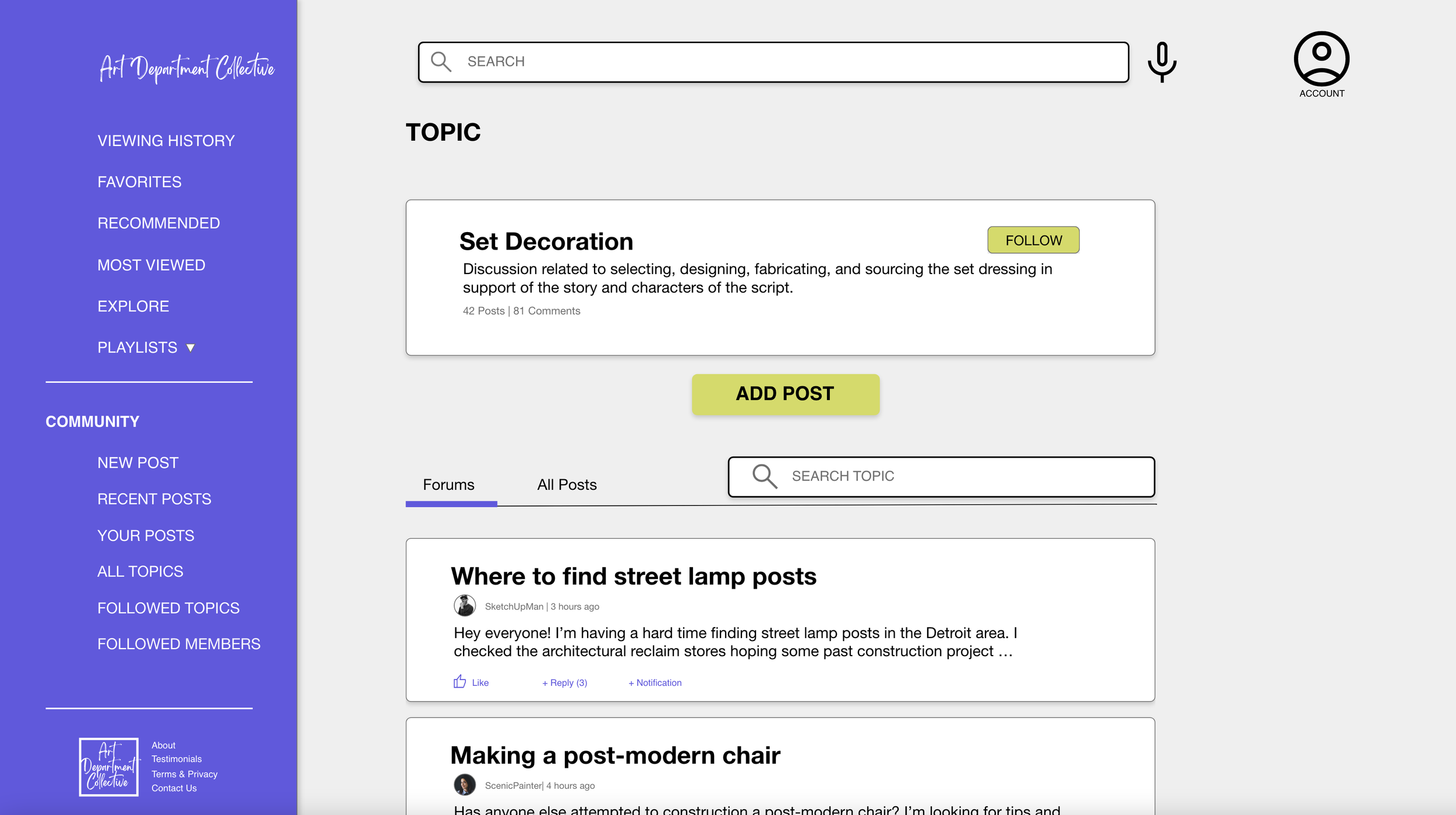
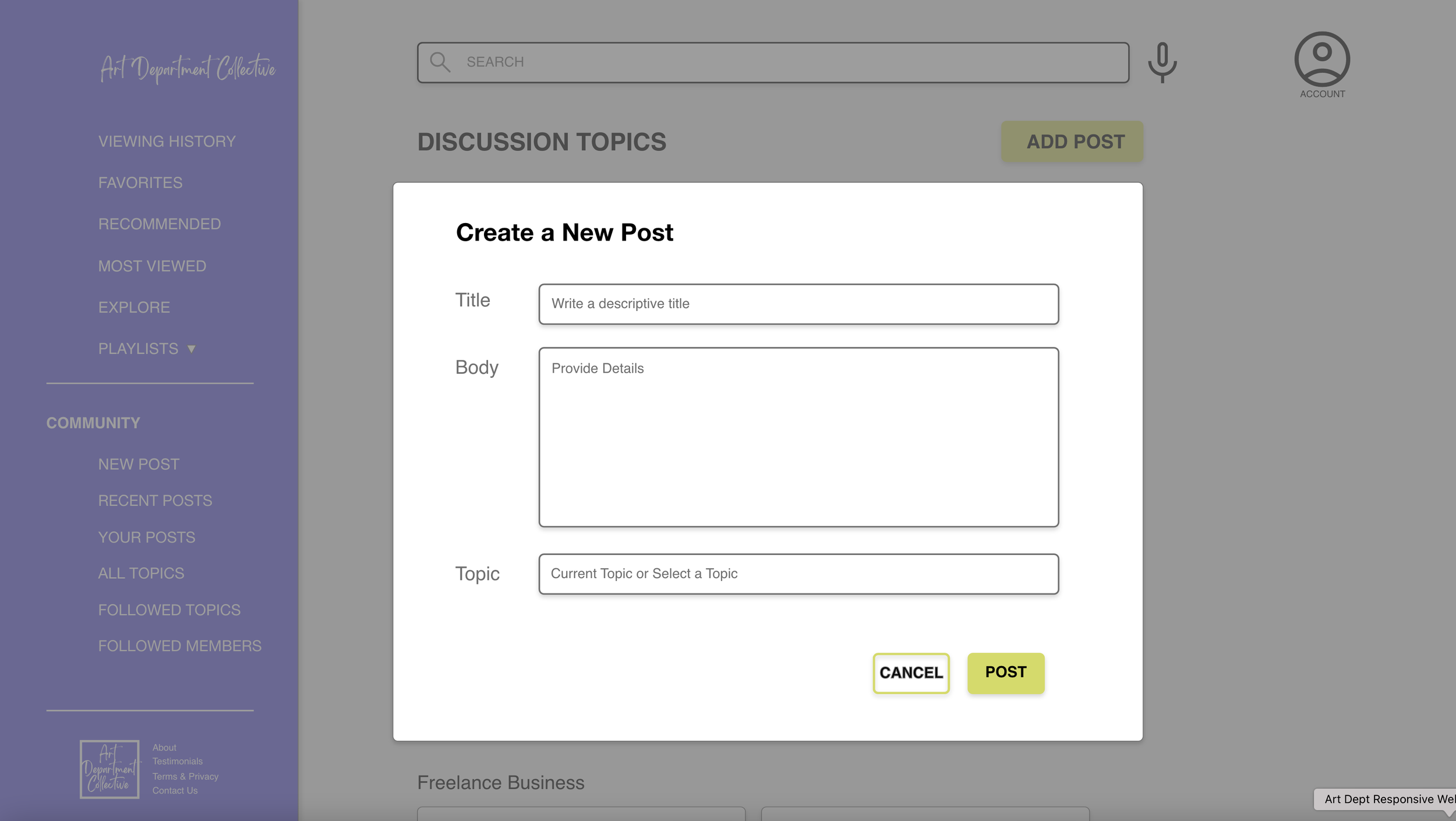
Users wanted to be able to connect with other art department professionals to learn the tricks of the trade in real time. As a result, I added a community section to the navigation bar. For the busy user, the navigation bar is always visible and provides quick hits on ways to sort content and contribute to the discussion. Additionally, the videos and descriptions provide skimmable details such as title and duration.
The discussion topic screens are one of the ways users can search for relevant community discussions and topics of interest. Each thread is easily skimmable so users can quickly find areas of interest. Users can also like conversations, which saves them for future reference They can add their own posts and reply to conversations to become more fully immersed in the community. They can also set up notifications for conversations giving them the most up to date information on a topic.
DIGITAL WIREFRAME VARIATIONS
Because the website will be viewed on various devices, consideration was made
for how the layouts will respond to the changes in size.
ITERATION
The low-fidelity prototype focused on the user flow of signing in and adding a post to the community portion of the site. The goal was to provide a streamlined way to add posts, view discussions, and interact with the content available. During the usability study, I gathered initial impressions of the community forum section and its potential uses as well as information about how the site navigates. Despite testing one specific user flow, wireframes were made of the entire website to ensure consistency of the design and demonstrate the capabilities of the complete site.
An unmoderated usability study was conducted of the low-fidelity prototype and included a ten-question system usability scale and a short questionnaire about general questions pertaining to how art department professionals find resources and information.
The design was then updated and visual content was added to create a high-fidelity prototype. The high-fidelity prototype went through peer feedback to make sure the changes didn’t create additional roadblocks.
Key findings from the initial usability testing of the low-fidelity prototype and the synthesis of peer feedback provided these insights:
PROBLEM SOLVING
Based on the insights of the usability study, the side navigation was updated to reflect the most requested options: video playlists and a quick link to add a new post. Additional information about each video was also added to include the username, topic tags, number of views, and upload date. This helps provide a more complete picture of the video and gives more opportunity to sort relevant context directly from every video brief.
Before Usability Study
After Usability Study
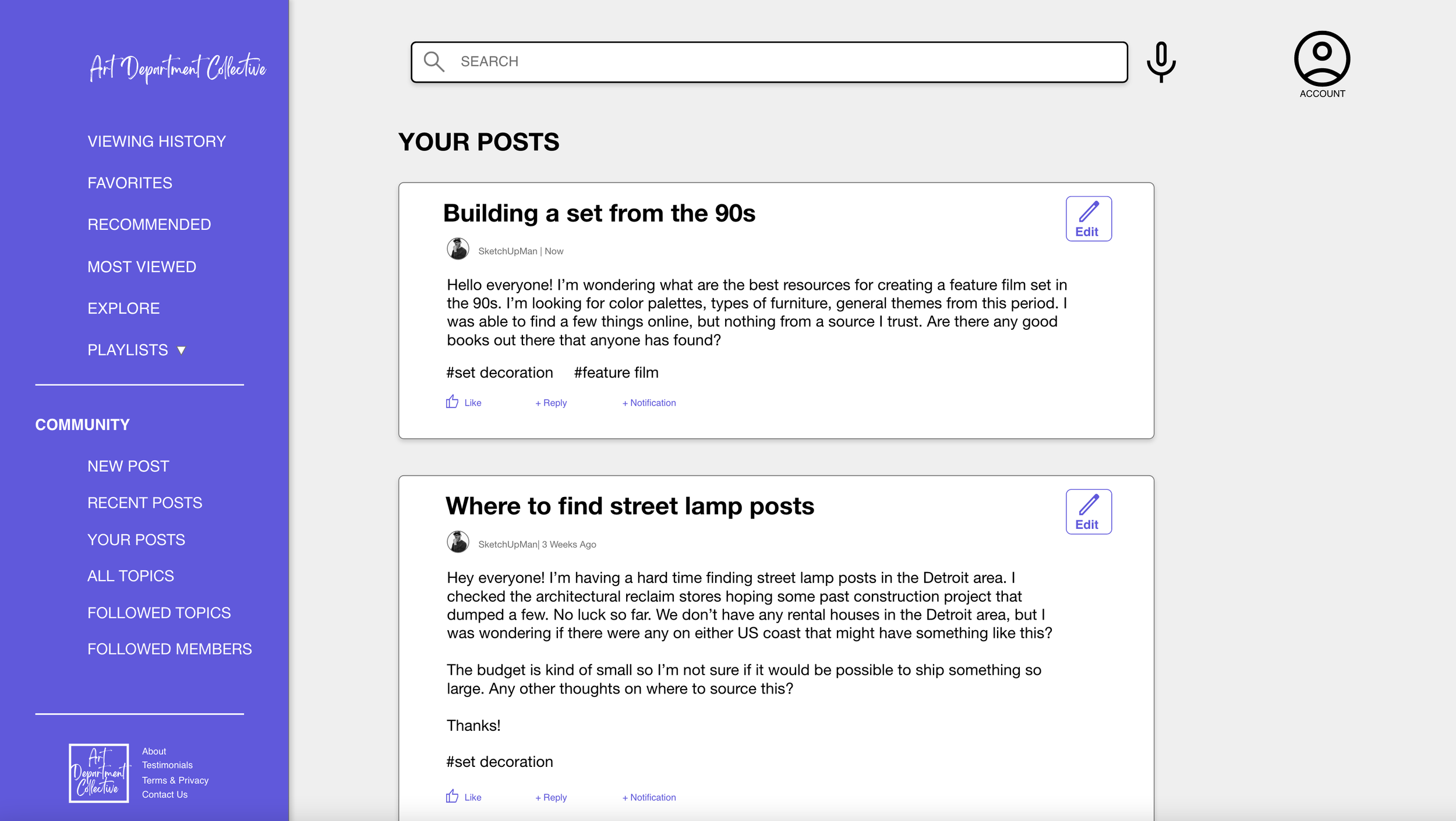
Users were confused by the initial user flow that brought them back to the discussion home page after creating a post. They expected to be able to view the post after they made it. They also wished for a quick way to make edits to existing posts. To solve this, I created a new posts page called “Your Posts” where users can view all their posts in chronological order and make changes as needed.

Before Usability Study
After Usability Study
The final high-fidelity prototype focused on streamlining the adding posts function to the community section of the website. It also answered user concerns about navigating easily between screens and added interaction points such as likes, notifications, and replies to the discussion sections.
Mockups: Original Screen Size
Mockups: Screen Size Variation
TAKE AWAYS
Impact:
This website is a valuable resource for art department seasoned professionals
and newcomers to connect and learn from one another. The next steps are to develop and test the playlist functions of the site. From there, release a beta version of the site for early adopters to test in real-time how the video and user profiles function. Then, make changes based on beta testing and provide all beta testers free membership to the official launch of the site.
What I Learned:
Creating a database website is complex in the ways that users can search and navigate the vast amount of content. Users have valuable feedback on how navigation can be improved and the categorization that might need to be created. It’s always a good idea to check with subject area experts, in this case, art department professionals, to make sure the resource is something useable for their day-to-day projects.